
A simple, friendly, beautiful EMR for pharmacists.
Sole designer + lead frontend specialist across a pharmacy EMR's full UI, leading a team of 5 engineers. Shipped a full-application redesign that introduced a bespoke, contemporary brand design language and made core workflows up to 4x faster for end users.
%20BEFORE.png)
%20AFTER.png)
UX Overhaul
Before, Scripted had a reputation for being powerful, but confusing.
In v4, I designed and implemented beautiful branded layouts with clear typographical hierarchy and consistent design principles, refactoring every screen in the EMR. I led implementation, but also designed the system in such a way that my team of 5 engineers could build within our new brand standard without me needing to personally polish every PR. And most importantly, users started raving about Scripted finally being simple in the months following deployment.
%20BEFORE.png)
%20AFTER.png)
Core Workflows
This redesign also streamlined the core Encounter workflow from a time-consuming multi-pager to a tidy one-screen modal that intuitively expands and collapses as the user works. We saved users a significant amount of time for every patient encounter.
I'm particularly proud of the "stoplight" icons in every section. Red means you're missing some required data, green means go. It's much easier to see how much work is left to be done.


Brand and Web UI
The entire Scripted brand is my design, from the logo to the color scheme to the layouts and interactions.
Our core application UI is beautiful, neutral, and information-dense. On our patient-facing website, we got to have a little more fun.
Scripted's patient-facing branding is in the same vocabulary as the clinical app, but is augmented with notes of digital brutalism and playful 3D animation rendered in browser.
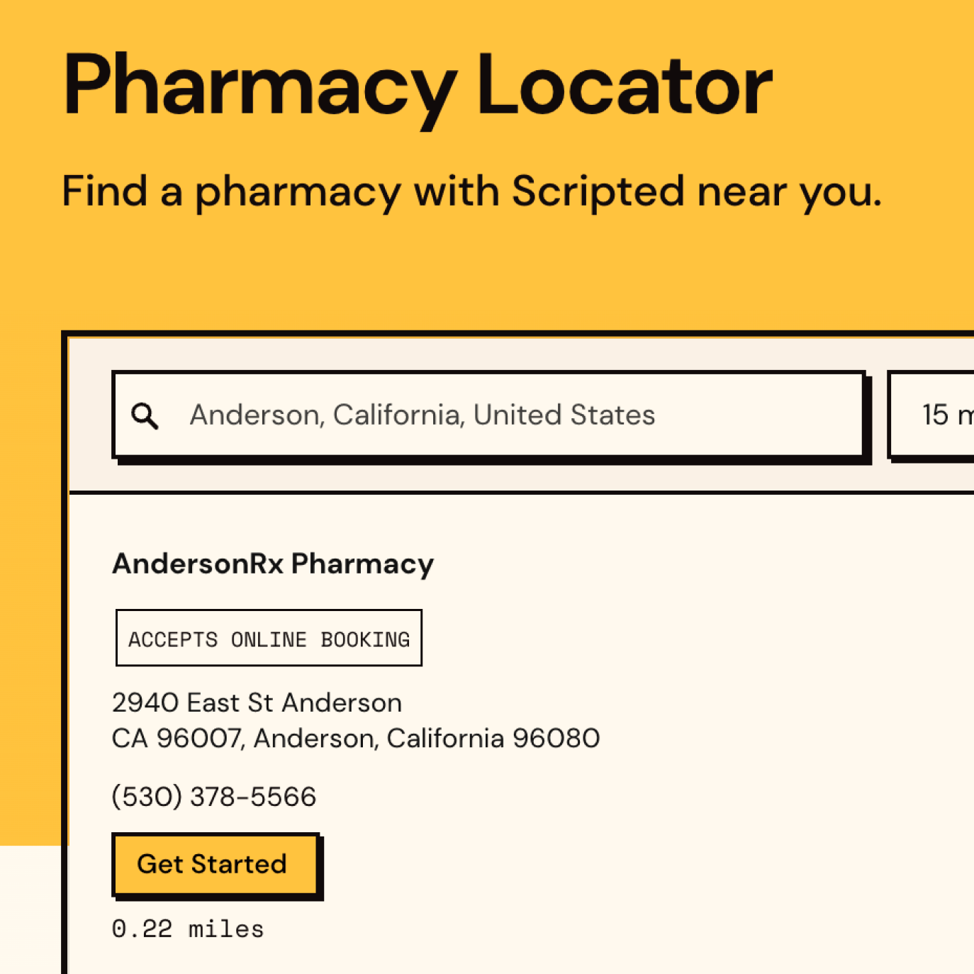
I led the entire implementation, from webdev to print to motion graphics and everything in between. I also implemented and maintain key infrastructure like dynamically-generated backend-integrated per-pharmacy landing pages and our 50-state pharmacy locator.
More details on my work at Scripted
- Architected and shipped Claude-powered agentic workflows in daily engineering practice: custom Claude projects with rich codebase context, MCP server integrations connecting to customer and product data, SOPs and playbooks, and agent pipelines targeting self-authored product documentation.
- Designed, developed, and deployed business-critical web applications independently: backend-integrated customer onboarding automations reducing onboarding timelines from four weeks to five days; a compliance-focused insurance pricing webapp supporting pharmacy billing accuracy across 100+ regional markets.
- Built and implemented a generative SEO strategy using dynamic JavaScript + WordPress landing pages: 6.9M impressions and 16K organic clicks in 12 months, zero paid advertising.
- Technical stack: Node, React, Typescript, AWS, APIs, SQL, Python, LLMs/Claude, Laravel, PHP, Figma.

An app turning real-world data into accurate rush predictions at Delta's most premium airport lounge.
Designed, built, and shipped a wall-mounted display that used a propietary algorithm ingesting real-world flight and ticket sale data to predict when patrons were likely to visit the Delta One Lounge at Boston Logan. Accurate within five covers 80% of the time, automatically updated every 15 minutes. Deployed and used in live kitchen operations.
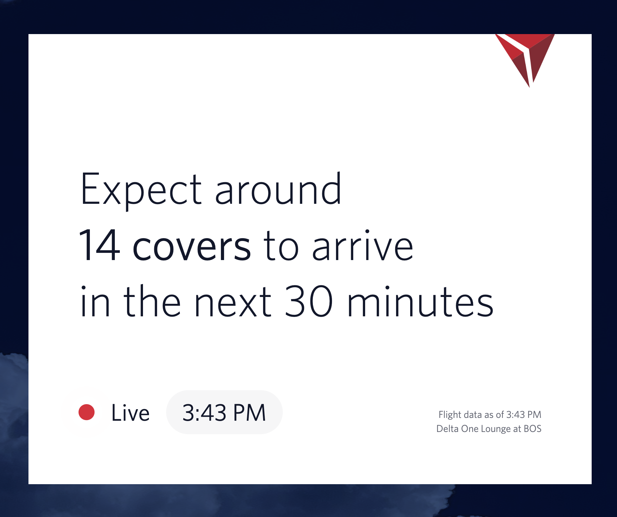
Turning Plane Ticket Sales into "Four Parties Arriving within 15mins"
The front-of-house team at the Boston Logan Delta One Lounge was struggling with managing staff breaks and ensuring adequate coverage during rushes. But they had all the information they needed: only patrons with Delta One tickets are allowed access to the lounge, and they got a daily report of tickets sold via email.
Using historical cover data and real-world counts of Delta One flight tickets sold, I was able to train a custom algorithm that predicted when guests would arrive based on the departure times of flights and a model of historical distribution of covers throughout the day.
After careful tuning, it was shockingly accurate: predictions within five covers 80% of the time for every 15 minute chunk of every day.
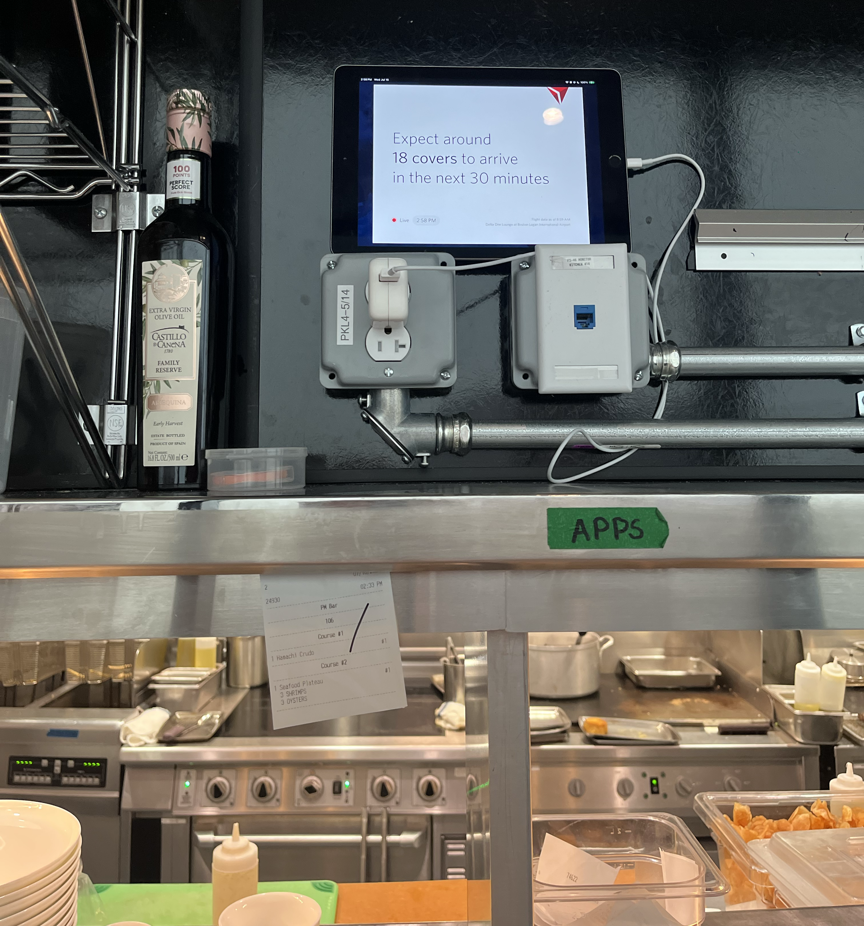
UX Optimized for Live Lounge Operations
Working with busy kitchen staff presented unique UX challenges.
Kitchen staff with busy hands can't fiddle with an iPad screen, and waitstaff need to be able to understand if a flight was delayed or cancelled at a glance while still running food.
I meticulously designed the UX for this app to require no human interaction while communicating critical updates clearly. To add the day's flight data, all the team needed to do was forward the email with ticket sales to my mailhook, which triggers a cloud function that queries FlightAware to get precise departure times and predict the day's spread-of-service.
FlightAware's API also pushed updates on flight delays or cancellations, which triggered full-screen color-changes and revised predictions to keep the staff aware of an unexpected rush with plenty of notice.

The ultimate Taylor Swift album-launch bingo board, co-authored by 3,000 Swifties in over 60 countries in 13 days.
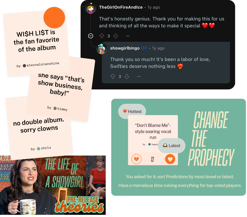
In the days leading up to the release of Taylor Swift's latest album drop, I launched a free online game where Swifties around the world could predict what would happen on the album. The most popular predictions, voted on by Swifties, became the squares on a playable bingo board for their first listen.
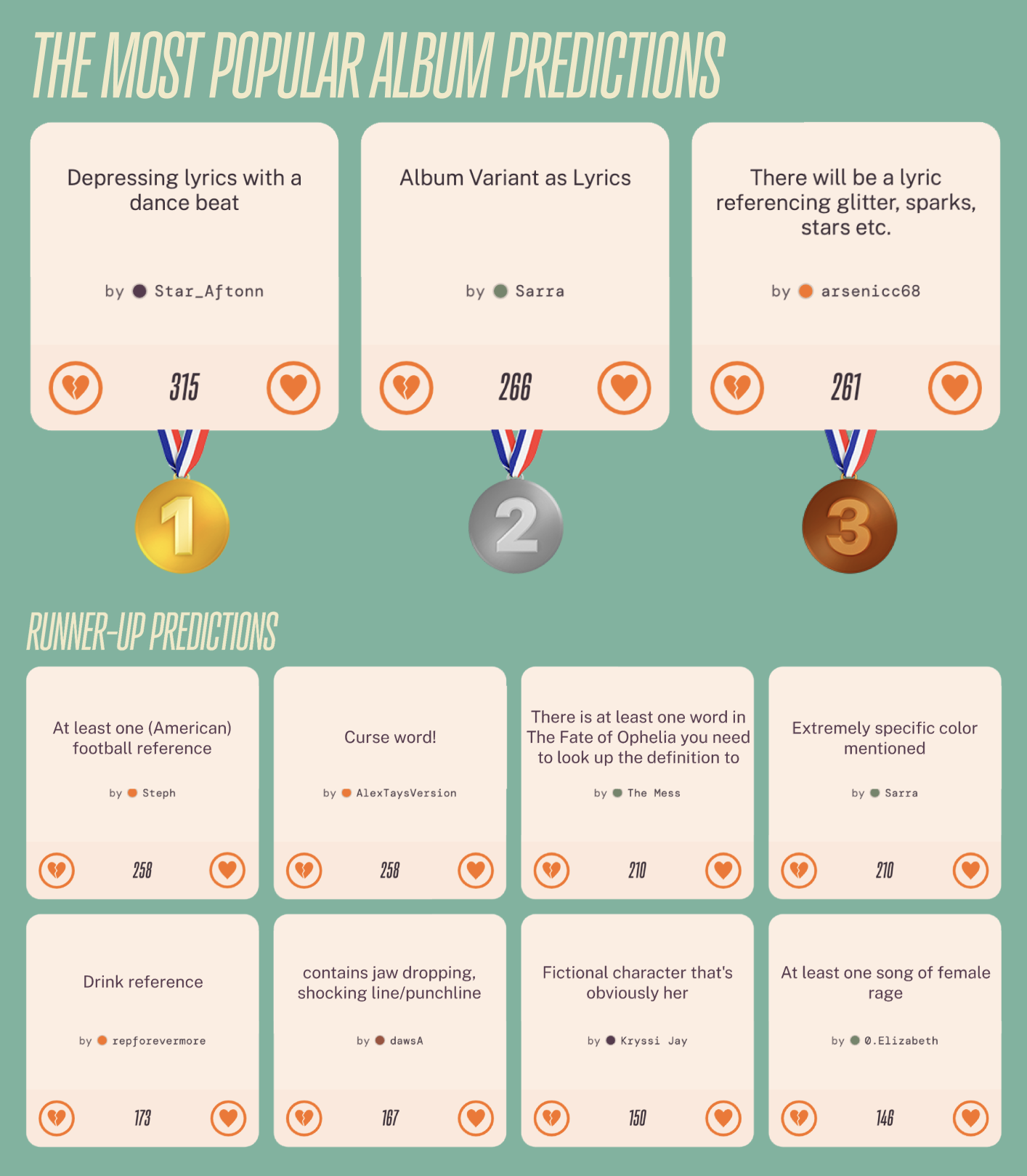
Swiftie-Approved, With Over 15,000 Votes Cast
Released just 13 days before The Life of a Showgirl, Swiftie response to this app was mind-blowing. On album release day, more than a thousand players visited the board and created an account on Showgirl Bingo (not required to play).
For users who created an account, retention and engagement were great. The average user voted on 5 different predictions, and 1 in 5 contributed their own. The average user returned multiple times after their first unique pageview.
Swifties were also vocal about features they needed: commenters on reddit demanded a "personalize" function allowing their posts they voted on to directly augment their personal board rather than relying on overall vote winners
The app was also shared by Swiftie influencers and covered by Swiftie YouTubers like Kailey's Corner.
Full Stack Engineering, Branding, and Marketing (Hyli's Version)
I developed Showgirl Bingo end-to-end in about two and a half weeks' worth of evenings and weekends.
I did EVERYTHING myself - created wireframes based on album vinyl color variants in Figma, wrote and deployed an MVP version for pre-release playtesting and feedback, rapidly iterated fan-demanded features, and marketed the app to Swifties across multiple social channels and email.
At midnight on album release day, refreshing my Firebase analytics to see 1,000 people playing concurrently on launch was one of my proudest accomplishments as an engineer.